Viewer app
6 minute read
The Viewer and Editor have similar layouts. The Viewer is used to browse data in the selected Workspace, while the Editor offers additional options and functions.
Figure 1. Viewer
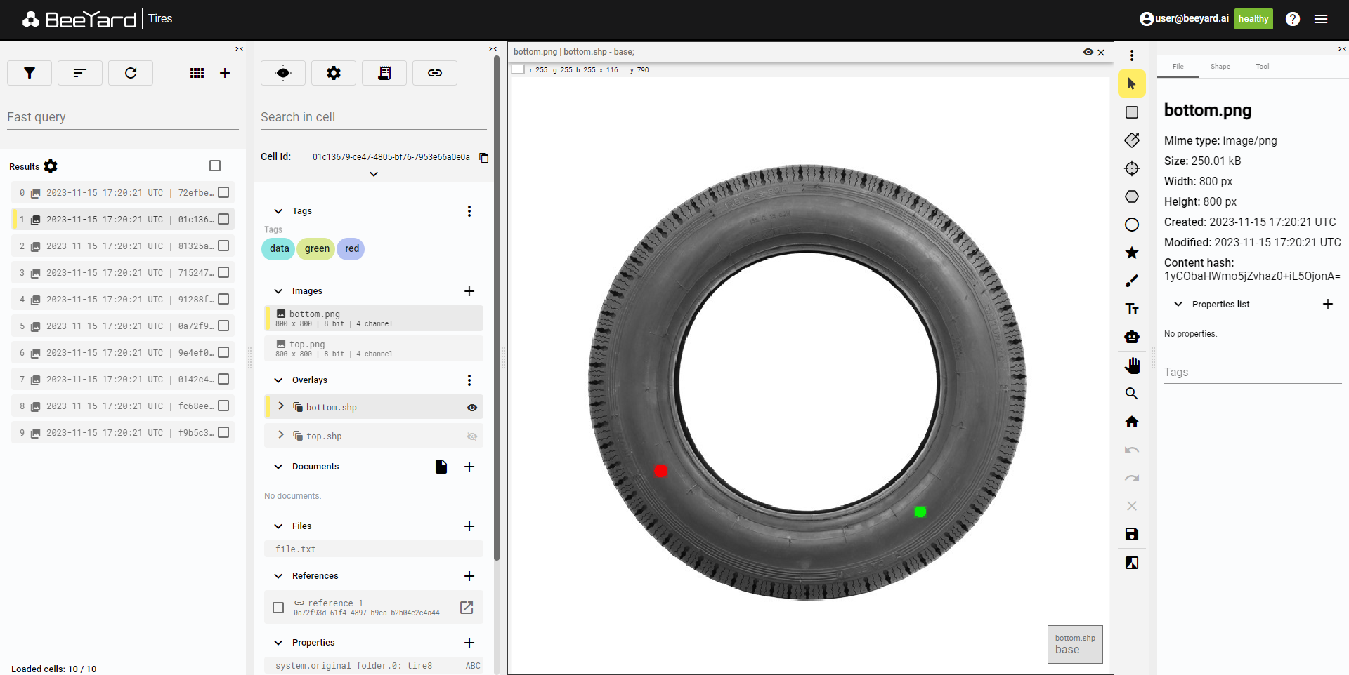
Edit Cell
The Viewer does not allow editing data, so editing options are not available there. To edit the data, select a Cell in the Viewer, and use the shortcut to display the Cell in the Editor.
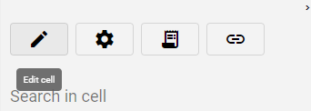
Figure 2. Edit Cell button
The second button in the line opens Settings with options for describing the data in the Cell. The third button opens the Logs, and the last button is used to copy the Cell ID.
Cell info settings
Within the cell info panel, users have the ability to modify displayed data information in the cell.
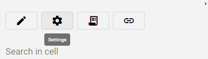
Figure 3. Cell info settings button
Setting options
Figure 4. Cell info settings
Tag Customization
Users can opt to select any tag category from the list or maintain visibility of all categories. Tags associated with the selected category are displayed, while those from other categories remain hidden for the files showcased in the cell info panel.
Tags expanded
This option allows tags to span multiple lines as needed. Alternatively, when this option is inactive, tags are condensed into a single line, with overflow tags represented by a "+X" chip indicating the count.
Display file Tags
Users can toggle the visibility of tags on files, providing greater control over data presentation.
Display file or shape properties
The option to show or hide properties on shapes or files is available, offering further customization.
Referenced Data
Users can opt to reveal or conceal files from referenced cells. For instance, enabling this option displays overlays from referenced cells in the overlay sections, allowing overlays to be superimposed on images.
Autoselect file when changing cell
When no file is selected for viewing, the system automatically seeks out the first suitable file and presents it in the viewer. Disabling this option prevents automatic file selection.
Autoselect overlay when changing image
Enabling this option ensures that the system selects an overlay with a matching name when an image is chosen. Otherwise, the overlay selection remains unchanged.
Preserve layer selection and visibility
Users can choose whether the system automatically reveals all layers of a newly selected overlay or maintains the previous layer selection and visibility. For example, if a user has only the "test" layer visible and selected in overlay "one," selecting overlay "two" will either retain the visibility of only the "test" layer or reveal all layers from the newly selected overlay.
Reverse sorting
By selecting this option, users can reverse the default alphabetical sorting order of files.
Query
In this section, you can create queries for the Cells in the Workspace. The Add query button allows you to add queries, the Sort button sorts the displayed Cells, and the Refresh button updates the list. There is also a shortcut button to display the Workspace in the Gallery app.
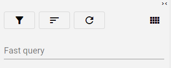
Figure 5. Query
For instructions on creating queries, refer to the Searching cells.
Use the Fast query line to display Cells with specific Tags. Click on the line and select the desired Tag from the list.
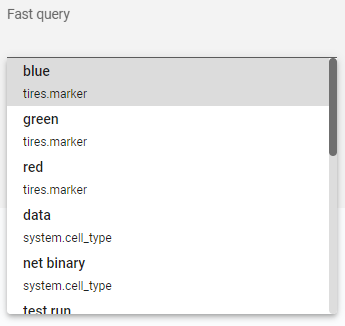
Figure 6. Fast query
If there are multiple active queries or selected Tags, you can combine them into a single query by selecting Compose them.
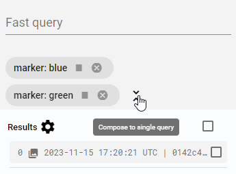
Figure 7. Compose queries
Result settings
The Cells in the list can be displayed with varying levels of information about the data inside. Click the Results setting button to access the settings.
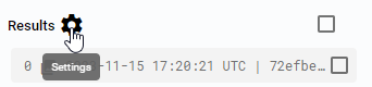
Figure 8. Results settings button
You can choose to display the list of Cells in two styles: as a list with text information only or with an accompanying image. Additionally, you can select specific Tag categories and Properties.
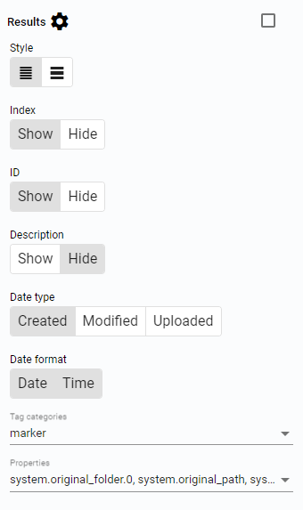
Figure 9. Results settings
Cells
The list of Cells displays all Cells that fit the query. If no active query is present, all Cells from the Workspace are displayed.
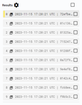
Figure 10. Cells
Next to each Cell is a check box. Selecting any Cell will show a control sum above the list, indicating the number of selected Cells compared to the total number of Cells in the list. A button with three vertical dots also appears, allowing you to download multiple Cells, download them with references, or copy the IDs of the selected Cells. There is also a standalone check box above the list to select all Cells at once.
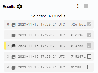
Figure 11. Selected cells
Cells check box
Each Cell has its own check box, and at the top of the Cells list, there is a check box for the entire list. Use these buttons to select specific Cells. The number of selected Cells is displayed at the top of the list.
Cells can be selected individually or all together. If no Cells are marked, the overall check box remains empty. When one or more Cells are marked, the overall check box becomes marked, and the button with three vertical dots appears next to it. Clicking the overall check box selects all Cells in the list, and clicking it again deselects all Cells.
Selected cells operations
If one or more Cells are selected, a button with three vertical dots appears next to the Results setting button.
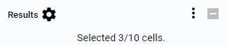
Figure 12. Selected cells operations button
Click this button to see available operations for the selected Cells.
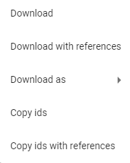
Figure 13. Selected cells operations
In the Viewer, you can download the selected Cells, download them with references, download them in VOC or COCO format, copy the Cell IDs, or copy the Cell IDs with references.
The Cells will be downloaded as a zip package. When selecting VOC or COCO format, you will be prompted to choose the names of the image files to be downloaded. The Cell IDs are copied to the clipboard as a list, and selecting the option with references includes the IDs of all referenced Cells.
Cell Details
When a Cell is selected, additional details can be displayed. By default, only the Cell ID is visible.
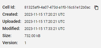
Figure 14. Cell details
Data
To view the data inside a specific Cell, select the Cell. You will see the data within the Cell, data connected to the Cell through references, or information about the data.
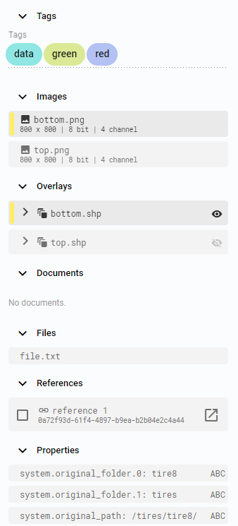
Figure 15. Cell data
View
The View section displays selected data from the Cell. It can be an Image with Overlay or any other File. The View can display a single item or be split into multiple windows to display more data.
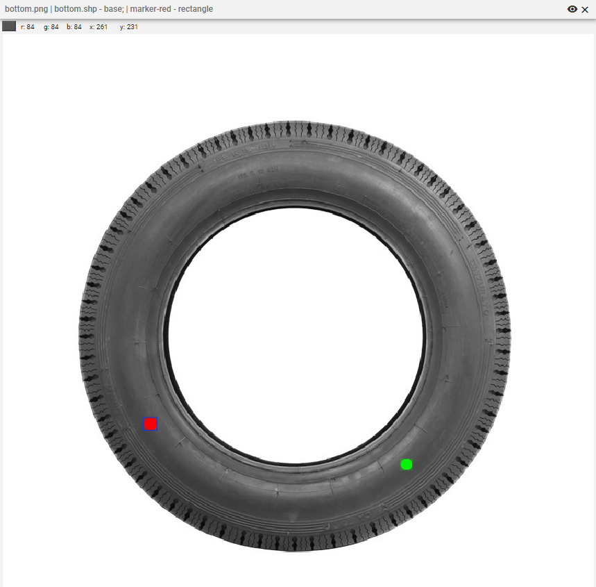
Figure 16. View
Color and coordinates
Hovering the mouse over the images will display the coordinates and RGB information.
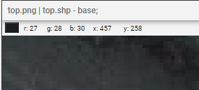
Figure 17. Color and coordinates
Layout setting
On the right side, there is a panel with three vertical dots, which represents the first button. Clicking this button reveals a hidden layout setting. You can split the viewer to display multiple images or files in the same Cell, enable a grid on the image, or enable properties of displayed objects. The panel also includes default functions such as the Selection tool, Pan tool, Zoom tool, Reset zoom button, and Filters setting.
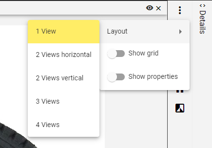
Figure 18. Layout setting
Details
The Details panel is initially minimized. When opened, it displays details about the selected image or object.
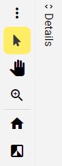
Figure 19. Details closed
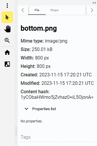
Figure 20. Details open
|
Tip
|
It is recommended to structure and name data in the Workspace in the same way across all Cells. This facilitates easy data management in BeeYard, such as ensuring that each Cell contains the same named data (e.g., two images, bottom.png and top.png) that are consistently displayed in the same position in the viewer layout.
|